MARRIOTT BONVOY
Rebrand & Web Page Design
I partnered with Marriott Bonvoy to quickly develop a proof of concept that reimagined their existing brand for a new wedding landing page. The goal was to bring a fresh, elevated look to showcase their wedding venues, services, and offerings in a way that felt modern, inspiring, and true to the brand.
MOBILE DESIGN
BRANDING & IDENTITY
WEB DESIGN
CHALLENGE
Marriott Bonvoy was gearing up to launch a digital product catering to customers looking to book destination weddings. The client team wanted the page to feel inclusive, to represent a wide array of customers, and to emulate the existing Bonvoy brand.
SOLUTION
Using the provided business and user requirements, I explored various layouts that captured the client's needs and created a mood board that incorporated the Marriott Bonvoy brand details along with diverse wedding imagery. Working closely with the client, I combined their ideal layout with the proposed visual direction and created a web page that was fresh, inclusive, and true to the brand.

Experimenting with the User Experience
I created wireframes to explore a range of layout possibilities, each focused on different ways users might navigate and engage with the content. Presenting wireframes early in the process allowed the client team to focus solely on the user experience—prioritizing structure, interactions, and information flow without getting distracted by visuals. This helped us align quickly on the overall approach before moving into visual design.


Visual Direction
I put together a moodboard that thoughtfully combined the client’s key priorities: existing branding, core color palette, diverse wedding imagery, and aspirational destination visuals. This step helped reassure the client that I understood their vision and design goals, and it built trust in my direction before moving into high-fidelity design.

Bringing it Together
Building on the approved moodboard and selected layout, I designed a high-fidelity mockup for Marriott’s Weddings landing page. The page guided users through their offerings, showcased real wedding inspiration, and provided clear entry points to begin planning their own event. The result was a cohesive and visually engaging experience that aligned with the brand and user goals.

Header Section
A landing section that features a search box that allows the user to search for different event types and venues.
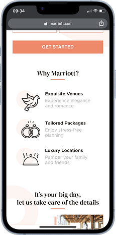
Why Marriott?
A section that showcases Marriott's core values and explains why the user should choose to plan a Marriott wedding.
Marriott's Offerings
List of various offerings and services that Marriott can provide through the wedding event planning process.
Featured Weddings
Stories of past Marriott weddings that showcase the locations, planning services, and accommodations provided by Marriott.
Inspiring Destinations
This section features a curated set of inspirational images highlighting wedding venues around the world. It’s designed to spark ideas and show the variety Marriott offers, from beach resorts to city hotels, helping couples imagine their perfect day.
Wedding Guides
Not sure where to begin? Marriott offers customizable wedding guides designed to support couples through every step of the planning journey, from inspiration to "I do."
Social Media Inspiration
Discover more wedding inspiration from real couples who celebrated with Marriott and shared their special moments on social media using official Marriott hashtags.
Responsive Layout
The client emphasized the importance of a fully responsive design, as their research showed that most couples begin the wedding planning process on their phones. Ensuring easy mobile access was key to meeting couples where they are and planning on the go.


Lessons Learned
1.
Mobile Matters
Most couples are wedding planning between work, errands, and scrolling on the couch, so designing for mobile first wasn’t optional. Making responsiveness a priority helped the experience feel seamless no matter where or how users accessed it.
2.
Wireframes are Underrated Heroes
Starting with wireframes helped ground the project in UX and function before diving into visuals. It made it easier to get stakeholder buy-in and reduced the need for big structural changes later.