MIT TECHNOLOGY REVIEW
Digital Redesign
My main directive as the lead product designer at MIT Technology Review was to overhaul the brand and visual design for the organization's core digital offerings.
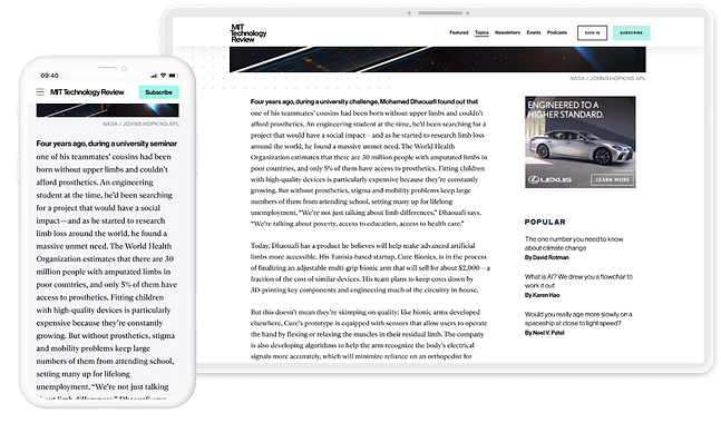
MOBILE DESIGN
BRANDING & IDENTITY
WEB DESIGN
CHALLENGE
Joining the organization to lead a major redesign came with a unique set of challenges. There were numerous stakeholders across different teams, each with their own priorities and visions for the website. The existing site had a long-standing legacy that many were understandably hesitant to move away from. Additionally, the organization had historically prioritized print, which meant digital design was often treated as a secondary concern rather than a strategic focus. On top of that, we were working with a small—but incredibly capable—tech team, which required thoughtful planning and close collaboration to make the most of our resources.
SOLUTION
To address these challenges, I took a strategic and collaborative approach throughout the redesign process. I embedded cross-functional collaboration into every phase to support stakeholder alignment and build org-wide buy-in. To avoid overwhelming the team, I broke the work into smaller, manageable projects that allowed for gradual, visible progress. I shared solutions early and often to maintain transparency and eliminate surprises. Close coordination with the engineering team helped ensure we stayed on schedule and delivered on schedule.

Starting with the Beginning...and the End
I kicked off the website redesign with a header and footer overhaul. This project was my introduction to the broader company with the potential for high-impact changes and an opportunity to showcase my design process to generate buy-in from teams across the company.

The Menu - Before
The original header menu was a plain, black mega menu with an overwhelming amount of pages that made discoverability difficult for readers.
The Footer - Before
The website previously featured an infinite scroll so there was no footer. This meant that links and pages typically expected by the user to appear in the footer were instead merged into the header menu, causing it to be even more overloaded and difficult to navigate.
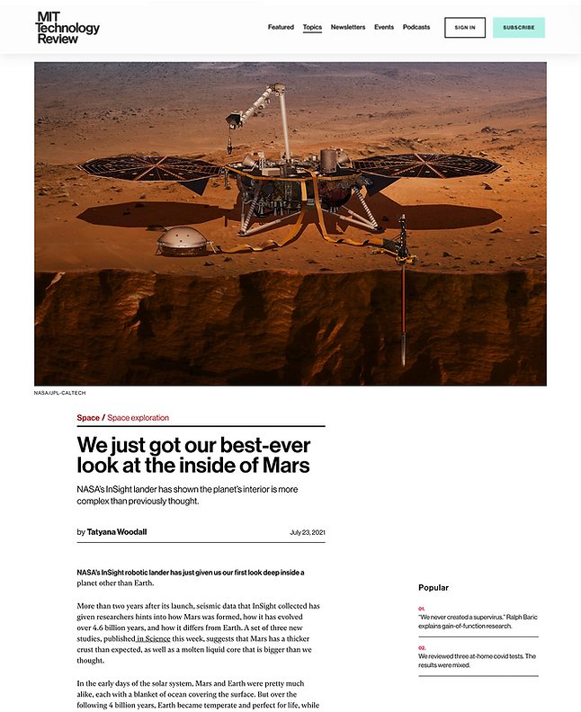
Brand New Header
My goal for the new header was to do a complete overhaul by creating distinct categories for improved content organization, incorporating visuals to generate interest, and designing an overall format that more easily enabled readers to find the next story to read thereby reducing bounce rate.


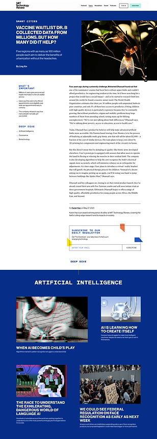
Introducing a Footer
In addition to including the standard links and pages users expect in a footer, I saw an opportunity to make it a playful, discoverable moment that honored the publication’s print legacy. I designed a layered visual treatment to evoke the feel of paper elements and incorporated rotating magazine cover art as a dynamic background that updated with each new issue. This updated footer not only created a distinctive visual anchor for the site, but also helped build trust with the print team, who were deeply invested in the magazine and wanted to see its presence meaningfully reflected in the digital experience.


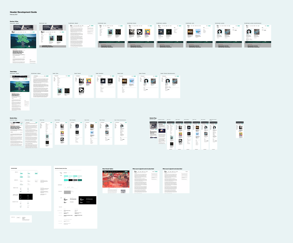
Development Guides
I created detailed development guides for both the header and footer, which streamlined implementation for the engineering team by reducing ambiguity and accelerating build time.

Story Page Redesign
After successfully redesigning the site’s header and footer, I was ready to tackle a more ambitious challenge: the story pages. As the primary way readers engaged with journalistic content, these pages were central to the site experience. They needed to not only showcase each piece effectively but also reflect the voice and identity of the publication.
Before
The story pages were built on a rigid WordPress template that offered little room for customization or brand expression. Large header images appeared first in the layout, often pushing the story title below the fold and weakening initial user engagement.
Moodboards & Branding
The brief for this project was to develop a visual identity adjacent to the MIT Technology Review brand. It needed to feel familiar but have a punchier, more tech-forward twist. To explore the possibilities, I created a set of distinct moodboards: Simple & Functional, Geometric & Retro, and Coder Chic.


Visual Ideation
To bring the visual direction to life, I created high-fidelity mockups that illustrated how the concepts from each moodboard could be applied across key story page elements. I presented each mockup alongside its corresponding moodboard to the leadership team and CEO to guide the discussion. In classic fashion, the final request was to combine elements from all three directions into one cohesive design.


Final Design
Based on the iterative feedback from the mock-ups, I created a final design that blended the colors, layered elements, dot work design, and typography from the three moodboards. The final story page design was engineered to integrate into the existing WordPress content management system so it wouldn't disrupt the editors' publishing workflow.

Header Section
The design opens with the headline, description, topic, and author to immediately orient readers to the story. A themed color background, chosen to suit the artwork and topic, is paired with a subtle dot grid and layered visual elements to add depth and visual interest to the experience.
Story Body
The core of the reporting lives in the story body, which was refreshed with a new typeface for improved readability and a more modern feel. The "Popular" section was also redesigned to surface additional stories and encourage further exploration.

Deep Dive
The Deep Dive section offers curated stories related to the selected topic, encouraging readers to explore more content within the same theme. By surfacing additional relevant stories, this section not only deepens engagement but also helps drive subscriptions by nudging casual readers closer to their story limit.
New Layout
The layout takes inspiration from a gallery space, paying tribute to the publication’s print roots and a nod to the art team’s vision. This design approach adds a sense of movement and visual intrigue, inviting readers to explore the content as if walking through a curated exhibition.


Stay Connected
Located prominently at the bottom of the story, this section includes an email capture feature designed to encourage readers to sign up for newsletters and marketing updates. Serving as a key element for lead generation, it helps build the subscriber base while fostering ongoing engagement with the publication.
Editor Customization
To better align the visual experience with each story’s tone and commissioned artwork, I introduced customizable color themes for story pages. Journalists can choose from blue, teal, green, or purple, while grey is reserved exclusively for sponsored content to clearly differentiate it. I also designed a vertical layout option, giving editors flexibility to select the orientation that best complements the artwork and storytelling.


Lessons Learned
1.
Design by Committee ...is a Trap
Collaboration is great—until your clean, focused design starts turning into a group project with no brakes. I learned (the hard way) that too many cooks can definitely spoil the layout. The key? Set a strong vision early, guide feedback with clear goals, and gently steer conversations away from “What if we just combined everyone’s ideas?” Spoiler: you probably shouldn’t.
2.
Get the Right People in the Room
Nothing slows a project down like realizing halfway through that a key stakeholder wasn’t looped in, or worse, that the engineering lift is way bigger than expected. I learned to make sure the right people are at the table from the start: design, editorial, engineering, and anyone else who might say, “Wait, we can’t actually do that.” It keeps things moving, avoids last-minute surprises, and saves everyone a lot of headaches (and Slack threads).
3.
Sell the Vision, not Just the Screens
I realized that good design isn’t just about the final product, it’s about bringing people along for the journey. Clear, compelling presentations were key to getting stakeholders excited and aligned. Walking teams through the why behind each decision (not just the pretty mockups) helped build trust, spark enthusiasm, and turn skeptics into champions. A little storytelling goes a long way.